

When I search “my gender” in my text message history, a deluge of metaphor rains down from my queer friends. A small sampling includes:
“My gender is a tiny frog on a lily pad!!!”
“This dress IS my gender.”
“My gender is a fruit bat wearing a little bow on its head.”
Once, I described my gender as a yellow ginkgo tree. When prompted during my first week of Visual Thinking and Web Design to select a metaphorical image to represent myself, I wasn’t surprised when I returned to the explosive yellow foliage.

Throughout the first few weeks of class, we have toyed with image, identity, and ownership. While the fundamental principles of design and copyright don’t directly connect to queer culture, I find myself musing over their relationship.
The nature of choosing an aesthetic or image to define oneself is, of course, not explicitly queer. Marketing companies have relied on visual identity since their inception. We are inundated with messages about how the products we choose define us.

“Wear this athletic brand and you’ll be more fit!”. “Drink this smoothie and you’ll be healthier!”. The status symbol of owning an object has come to define the consumer. Often, for-profit market strategies are laced with implied fear and inadequacy. You are not good enough as you are, but if you “buy this product! You can be better!”
The question of queer aesthetics, however, brings to light an affirmative relationship to visual identity that reminds me of our class activity. Knowing who you are, what images feel the most like you? What images affirm your identity? From violets in the 1930’s to carabiners in modern times, queer people have used images and aesthetics to more safely connect with one another, celebrate themselves, and give voice to their true identities.

I was still thinking about visual identity when we moved on to capturing the six basic elements of design through photography. Most class participants are attending school while continuing to work established jobs and care for their families. Thus, while this assignment was not inherently personal, most ended up taking photos around our homes. When posting our photos to share with our classmates, we were giving one another a peek into our lens on design as well as our personal lives.

Starting with the element of line, I did laps around my one bedroom apartment trying to find a strong visual example. During this time, my dog wandered out onto the patio, and eureka! The iron bars on our outdoor railing provided a striking series of bold black lines, contrasting with the organic greens and browns of the courtyard below.
After capturing my photo, I was struck by how difficult it was to conjure up a strong example of line despite the fact that I see my patio every day. I take in visual information constantly, and while I may subconsciously notice the elements of design, I often lack the presence of mind to intentionally process what I perceive.
How much of design is simply breaking the mold of subconscious visual processing with an attention-grabbing image? As Professor Ruby noted in class, we see line, shape, space, color, value, and texture every day. With the accessibility of social media, people with no formal education in design or art regularly ponder the composition of a photograph. The study of design, then, is really a matter of refining one’s lens and strategically using the elements and principles to manipulate an audience’s attention.
Take, for instance, the following three renderings of a tiger. The creators of each have used the elements and principles of design to form a narrative. A narrative is the combination of strategic composition plus the subject defined.

A B C
Our first tiger, A, is quite realistic. The artist has used rich orange and black, using color to make the animal immediately recognizable. The tiger is set on a white background, but despite the flatness of the negative space, the tiger’s back foot appears to be peeling off the ground, as evidenced by the small shadow under its foot. Additionally, the artist has utilized foreshortening so the back foot is of a different scale from the tiger’s head, communicating that the tiger is leaping toward the viewer. Thus, the artist has manipulated space, creating a form that communicates movement. The term “form” refers to the interacting shapes in both negative and positive space that create the design. We can also note a number of the organizing principles of design. Balance is certainly at play, as the tiger takes on an asymmetrical shape. Proportion and scale are evident, given the aforementioned foreshortening. We also can note a strong use of emphasis, as the use of these strategies draws the eye directly to the tiger’s face and, alternatively, his hind leg.
In our second image, tiger B, we see a more organic and playful rendering of the tiger. Repetition is used in the pattern of leaves surrounding the animal. We see an example of proximity with the birds present on the tiger’s back. Additionally, this image features more symmetrical balance than our first. Collectively, these choices communicate a narrative of the tiger that is more peaceful than our first image. Where tiger A communicates fierceness and motion, a true predator, tiger B is in harmony with its surroundings. The narrative here is peaceful and fanciful.
Lastly, tiger C most strongly utilizes the elements of line and shape and the principles of balance and emphasis. Here, a tiger is created out of both positive and negative space, creating a strong form. It is notable that we only see the tiger’s head, and thus we see an icon of the tiger rather than the full animal. The bold black and cream contrast paired with notable symmetry draws the viewer to the tiger’s eyes. Here, the tiger is neither violent nor serene, but instead a stable force that demands reverence.
Despite our everyday perception and use of design elements and principles, we often process both an image’s formal elements and resulting narrative subconsciously. By beginning to dissect the form of an image, one can then specify the narrative description that the visual is attempting to communicate. The elements of an image are the puzzle pieces that the creator assembles to form the visual, where the organizing principles of design are the strategies they use to organize the image. These tools used together can successfully communicate visual stories.
We naturally craft and perceive visual stories, but formal elements and principles are the means of intentionally refining our message. I think again of queer aesthetics and flagging. When one intentionally crafts their visual identity in the world, they are refining their message.
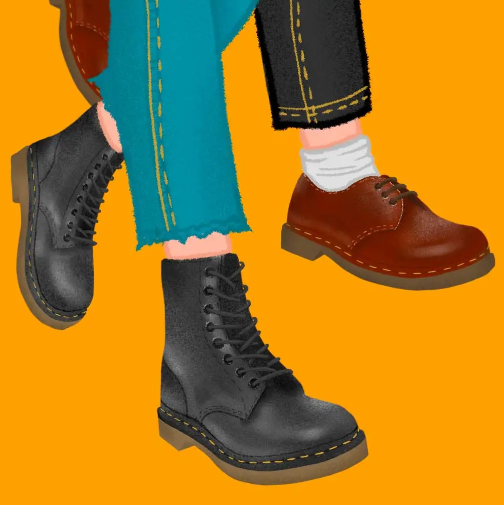
While anyone could wear rainbow accessories, combat boots, or a carabiner, the intentional curation of a queer aesthetic is a refined visual story. Complex discourse has built over the past few years regarding fashions that have previously served as lesbian flags becoming popular with straight women.
While one obviously can’t bar any type of person from wearing particular clothing or accessories, this emotional response is better understood when one understands the stakes and strategy of design principles. What does it mean to intentionally curate the image of oneself?
This question of who owns what images brings us to the third subject of class this month: copyright. One need not always worry about copyright thanks to a beautiful legal concept called Fair Use. When utilizing copyrighted material for education, news reporting, parody, or criticism you need not pay the owner of the copyright.
In all other cases, however, you need to use copyrighted work ethically and legally. Plenty of websites offer resources to find copyright free visuals; Unsplash is my personal favorite. You can also reverse-image search a photo you’d like to use (such as my beloved Ginkgo tree from our first exercise) to find the creator and owner of the image.

From here, you can sort out what guidelines are required for image usage. Some creators allow you to use their work for free, provided you cite them in a specified way. In other cases, you can pay a fee to lawfully use the image.
Creative Commons is an excellent resource for creators looking to ethically copyright their work. Copyright law spends a lot of time policing artists for using copyrighted work and debating the official owner of intangible ideas. In the western world, usually the answer of ownership is whoever filed the paperwork first! Creative Commons offers smaller artists the opportunity to protect their work while also authorizing certain types of collaboration. When establishing a Creative Commons license, an artist can specify what type of attribution they’d like to require, whether or not they’d like to make their work available for commercial use, whether or not they allow fellow artists to adapt their image, and more!

Visual identity is personal, formal, and material. While my queer friends continue to text me metaphorical self portraits, I begin to interrogate what formal elements make these images resonate with them. Why this image of this fruit bat, rendered in just this way? What about the balance of this image speaks to you?
What narrative are the principles of design telling here, and what is relatable about that story? Philosophically, images belong to both the maker and the viewer, as we find ourselves in artifacts of the visual world. Materially, however, images belong to their copyright holder, and with tools like Creative Commons, one can use copyright to connect more deeply with artists. It is both ethical and meaningful to find the creators of the designs we find compelling. We get to expand our awareness of their work, and we give artists due credit and reverence.
As I continue throughout this semester, I’m pondering the connections between formal analysis and identity. How does one manipulate the elements and principles of design to make an audience identify with their work? How do design choices become associated with certain social groups? How do the small, formal building blocks of design ultimately inform powerful messages?
